
When your phone felt tactile and playful? They were experiences. Research shows our attention span dropped from 12 seconds in 2000 to approximately 8 seconds by 2013 Getabstract shorter than that often cited goldfish.
Apple quietly removed features we loved. Some disappeared with iOS updates. Others faded as the App Store evolved. We forgot. But our brains remember what mattered, the old iOS features that made our phones feel less like productivity tools and more like extensions of ourselves.
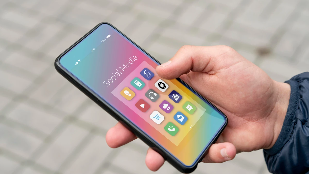
When our devices became smarter, our attention spans shrank. In this article, you’ll discover which beloved iOS features disappeared and why we miss them even if we don’t consciously realize it. And you’ll understand whether we can get some of this magic back or if we’re forever trapped in an endless scroll, eight seconds at a time.
1. The Great Flattening
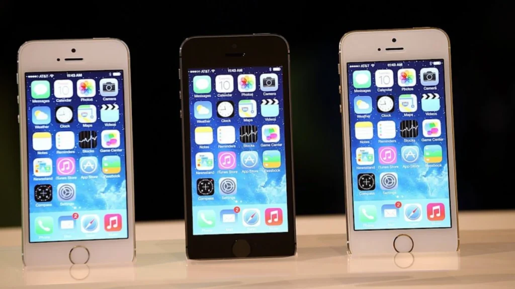
Your iPhone used to have a personality. iOS 6 had detailed textures everywhere. Linen backgrounds. Leather stitching on the calendar. Rich wood grain in the bookshelf, Macworld. The Notes app looked like an actual yellow legal pad.
iOS 7 flattened everything. Gone were the textures, the shadows, the visual depthof Macworld.” But something else got lost. Skeuomorphic design,n making digital things look rea,l helped our brains. When the calculator looked like a Braun calculator, you knew what it did instantly.
Your brain has to work harder to tell apps apart. And studies show constant app switching diminishes our ability to concentrate on single tasks Lone Star Neurology. When everything looks the same, nothing holds your attention.
2. Cover Flow
You’d flip your phone sideways. Album covers would cascade across your screen in 3D, spinning as you swiped through your music collection, 512 Pixels. Cover Flow made browsing feel like flipping through records at a music store.
Album art mattered. Apple killed Cover Flow in iOS 8.4 back in 2015 Wikipedia. Now you get grid views. Tiny squares. Efficient? Sure. But when’s the last time you actually browsed your music for fun?
We traded the tactile joy of discovery for speed. Your music library became a database to search, not a collection to explore. The album art that artists spent months perfecting? Shrunk to thumbnails, you barely notice.
3. Game Center
Game Center launched with iOS 4, draped in green felt like a pool table, TechRadar. It was your gaming identity. One place for all your achievements, leaderboards, and friend challenges across every game you played.
Friends could see your high scores. Everything gaming-related had a home. Apple axed the standalone app in iOS 10 in 2016 Wikipedia. Those features are scattered across individual games, with no central hub to connect with your gaming friends on CitizenSide.
Open each game separately. Want to challenge a friend? We went from one focused place to hundreds of disconnected apps. That’s not progress. And fragmentation kills attention spans faster than anything else.
4. 3D Touch
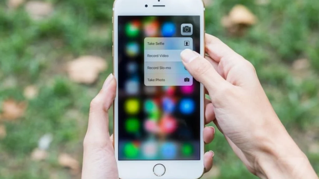
The iPhone 6s introduced 3D Touch; your screen could tell the difference between a light tap and a firm press. Press an app icon harder, and hidden menus appear. Press a link, and you’d peek at the page without leaving your app.
Apple quietly killed it. Replaced it with “Haptic Touch,”just holding your finger down longer. Sounds similar. But here’s the thing: 3D Touch rewarded focused attention. Haptic Touch requires patience. Wait. Keep holding. Don’t lift yet.
But our attention spans don’t wait anymore. We tap and expect an instant response. The subtle difference between a press and a hold? Too much effort for distracted minds. So the feature that rewarded focus died because we lost the ability to focus.
5. The Home Button
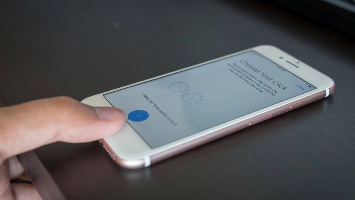
The home button lived on every iPhone from 2007 until the iPhone 8, SlashGear. One physical button. Always in the same spot. Always did what you expected.Double-click for multitasking. That satisfying click when you pressed it. Touch ID that just worked.
February 2025 marked the official end; Apple stopped selling any iPhone with a home button, UNILAD Tech. Now you swipe up from the bottom. Or middle. Depending on the app. Sometimes it works. Sometimes you swipe three times.
Physical buttons ground us. Your thumb knew exactly where to go without looking. That tactile feedback told your brain “action completed.”Research shows even smartphone presence reduces our available cognitive capacity, University of Chicago Press.
6. Skeuomorphic Icons and Textures
Early iOS apps looked like the real things. The Compass had a needle that actually moved. Voice Memos showed a vintage microphone. The Calculator looked exactly like a Braun ET66 buttons and all.
Then flat design happened. Everything became abstract rounded squares with simple symbols. Minimalist? Yes. But your brain has to work harder now. Detailed visuals engage more neural pathways.
When the Compass looked real, multiple parts of your brain activated visual memory, spatial recognition, touch anticipation. And heavy smartphone multitasking creates cognitive overload that impairs long term attention control Lone Star Neurology.
7. Slide to Unlock
Slide to unlock. You had to do something. Swipe your finger across the screen and watch the text glide with you. Physical action. Visual feedback. Deliberate choice.It felt good. Like opening a door instead of walking through an automatic one.
Face ID killed it. Now your phone just unlocks.But you never chose to engage.That matters more than you think. Slide to unlock was intentional. You decided, “I’m using my phone now.” That tiny moment of deliberation created a mental boundary.
Your phone unlocks itself dozens of times a day. You didn’t mean to check it. You just looked. And suddenly you’re scrolling.We traded intention for convenience. Turns out, intention was keeping us focused.
8. iTunes App Syncing
Remember plugging your iPhone into your computer? iTunes would open. You’d manually sync your apps, music, and photos. Drag and drop. Choose what goes on your device. It required a cable. But you had complete control. Some people loved this.
Every app was a conscious choice. Your music library was curated, not just dumped from the cloud. You organized everything before it hit your phone. The cloud killed iTunes sync. But we lost deliberate digital curation.
Manual processes forced focus. The article on Thrive Global mentions research showing it takes an average of 25 minutes to refocus after being distracted. Getabstract, and the author is Amra Beganovich from the Amra and Elma agency.
9. Notification Badges You Could Trust

A red badge on your phone was a rare event, a message from someone who mattered, an update worth your attention. Notifications were designed to notify, not to nag. Now, those little red circles have become instruments of digital anxiety.
Every app competes for your attention with badges that accumulate into the dozens, then hundreds. Research shows it takes an average of 25 minutes to refocus after being distracted. Getabstract, and most of us face dozens of these interruptions daily.
The attention economy weaponized what was once helpful. The notification badge transformed from a useful signal into a psychological trigger. We lost notifications that actually notified us of things that mattered, replaced by an endless stream of manufactured urgency designed to keep us tethered to our screens.
The Simplicity of Early Apps
Early apps understood restraint. Instagram began as a photo filter app. Twitter gave you 140 characters. Instagram isn’t just photos anymore; it’s Stories, Reels, Shopping, and a feed algorithm that thinks it knows what you want better than you do.
Each notification, each new tab, each algorithmic suggestion fragments our attention further.Apps that did their job and let us return to our lives, rather than demanding constant attention.
We’ve become so overwhelmed by feature bloat that we evaluate and discard information in the blink of an eye. I’ve found the Microsoft study about attention spans, information about mobile devices and attention from The Conversation, and the 1.7-second statistic from SQ Magazine.
What This Reveals About Our Attention Spans?
Research from Microsoft found that average attention spans dropped from 12 seconds in 2000 to just 8 seconds by 2013, precisely when smartphones became ubiquitous.
Mobile devices encourage us to skim surfaces rather than deeply focus, training our brains to peck and hover without fully grasping information, LinkedIn. The tools we once used with intention now use us, fragmenting our attention into ever smaller pieces.
The nostalgia we feel isn’t just about missing features, it’s about missing our ability to pay attention to what matters. We miss being able to finish a thought, read an article, have a conversation without instinctively reaching for our devices.
